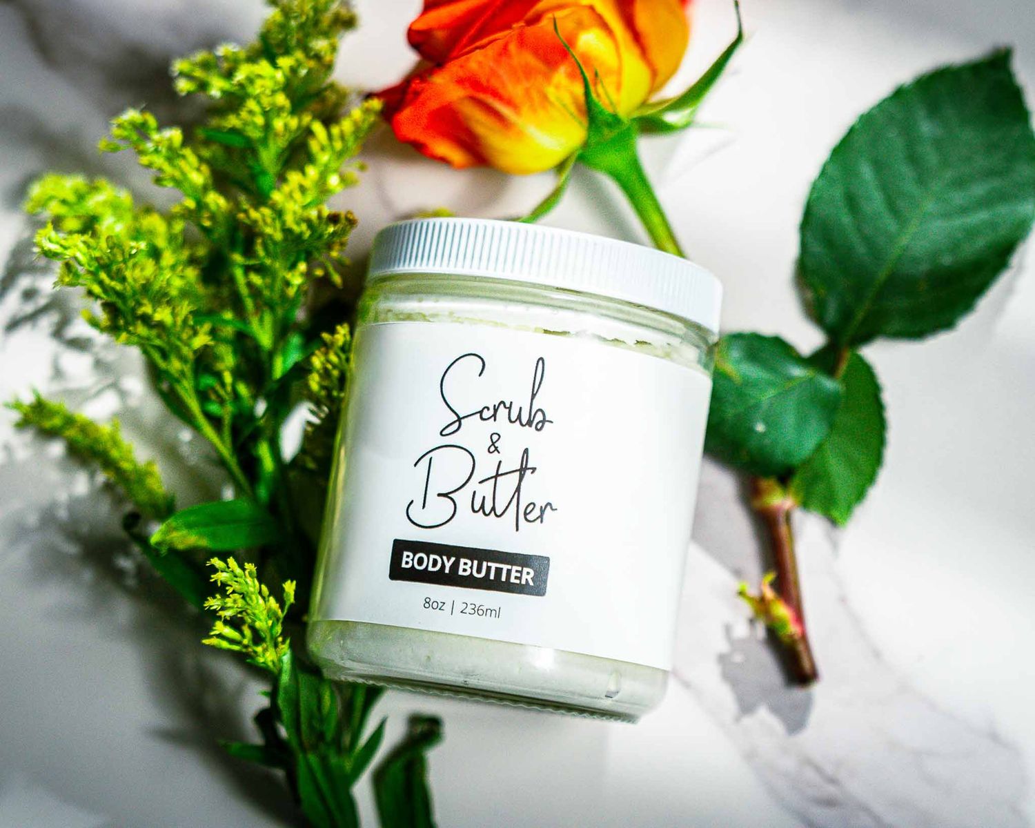
SCURB & Butter
Brand Elevation & Product Direction

CLIENT: SCRUB & BUTTER
ROLE: CREATIVE DIRECTION, PRODUCT STYLING, PHOTOGRAPHY, VISUAL BRAND STRATEGY
PROJECT TYPE: BRAND ELEVATION PROPOSAL & DIRECTED PRODUCT CAMPAIGN
The Challenge
Scrub & Butter is a homemade body butter brand offering all-natural body care products. While the product quality was strong, the visual presentation lacked the cohesion and premium positioning required to compete within the saturated wellness and skincare market.
The objective was to elevate brand perception, create visual consistency, and develop imagery capable of increasing conversion across eCommerce and social platforms.
Strategic Approach
Rather than simply producing product photos, the project focused on building a cohesive visual language.
Three strategic pillars guided the direction:
1. Premium Positioning
Shift the visual identity from handmade craft to elevated wellness.
2. Ingredient Transparency
Incorporate botanical and textural elements that visually reinforce the brand’s natural claims.
3. Conversion-Oriented Composition
Ensure brand name legibility, packaging clarity, and tactile product texture remained central in every frame.
Creative Direction
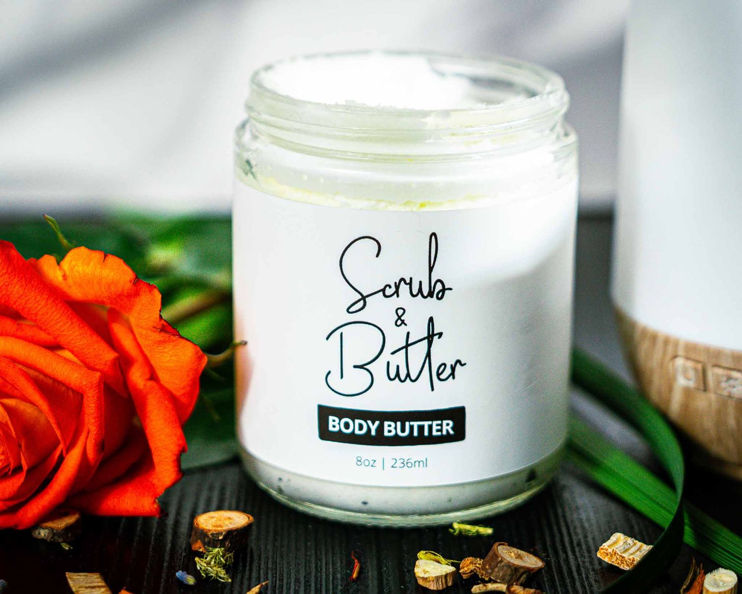
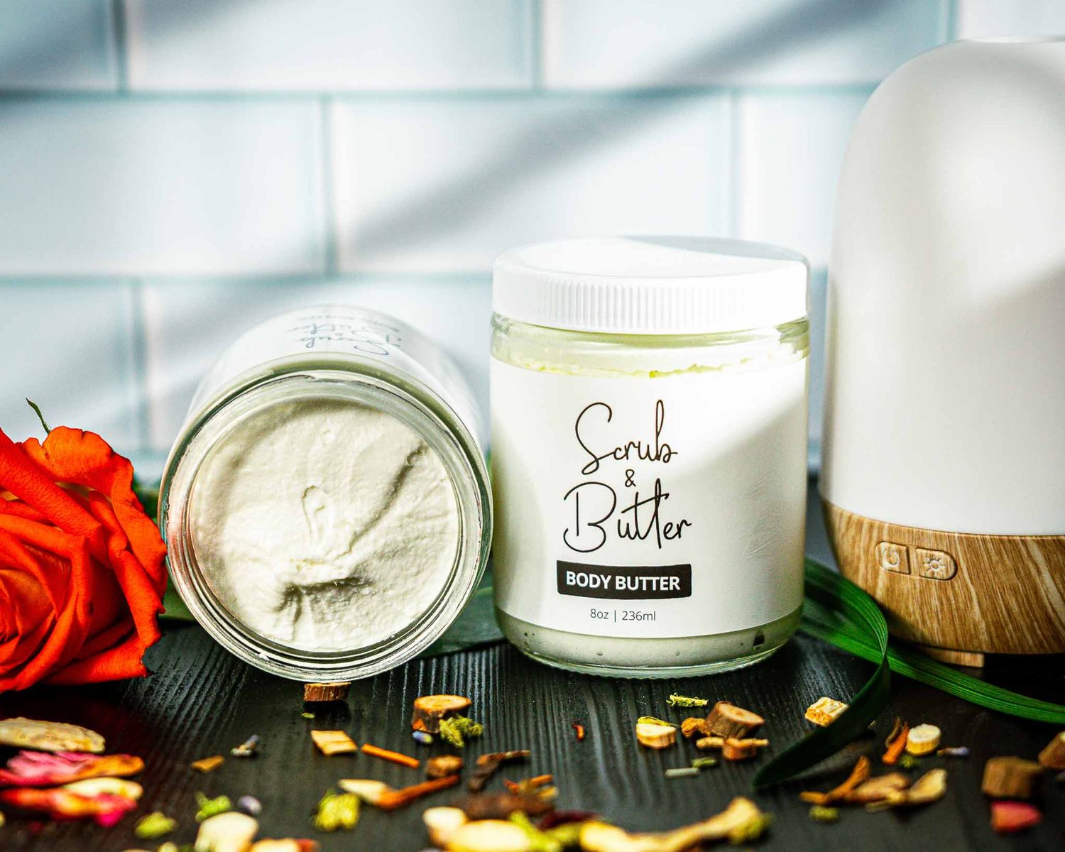
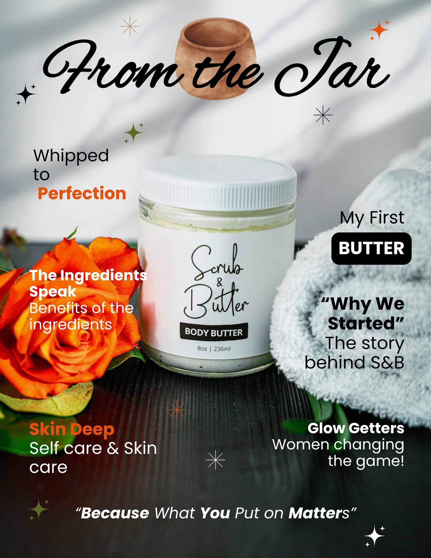
The shoot was designed around controlled environments that evoke spa energy and sensory indulgence.
Key decisions included:
• Soft directional lighting to enhance product texture
• Natural marble and dark wood backdrops to suggest premium minimalism
• Botanical accents to visually represent ingredient authenticity
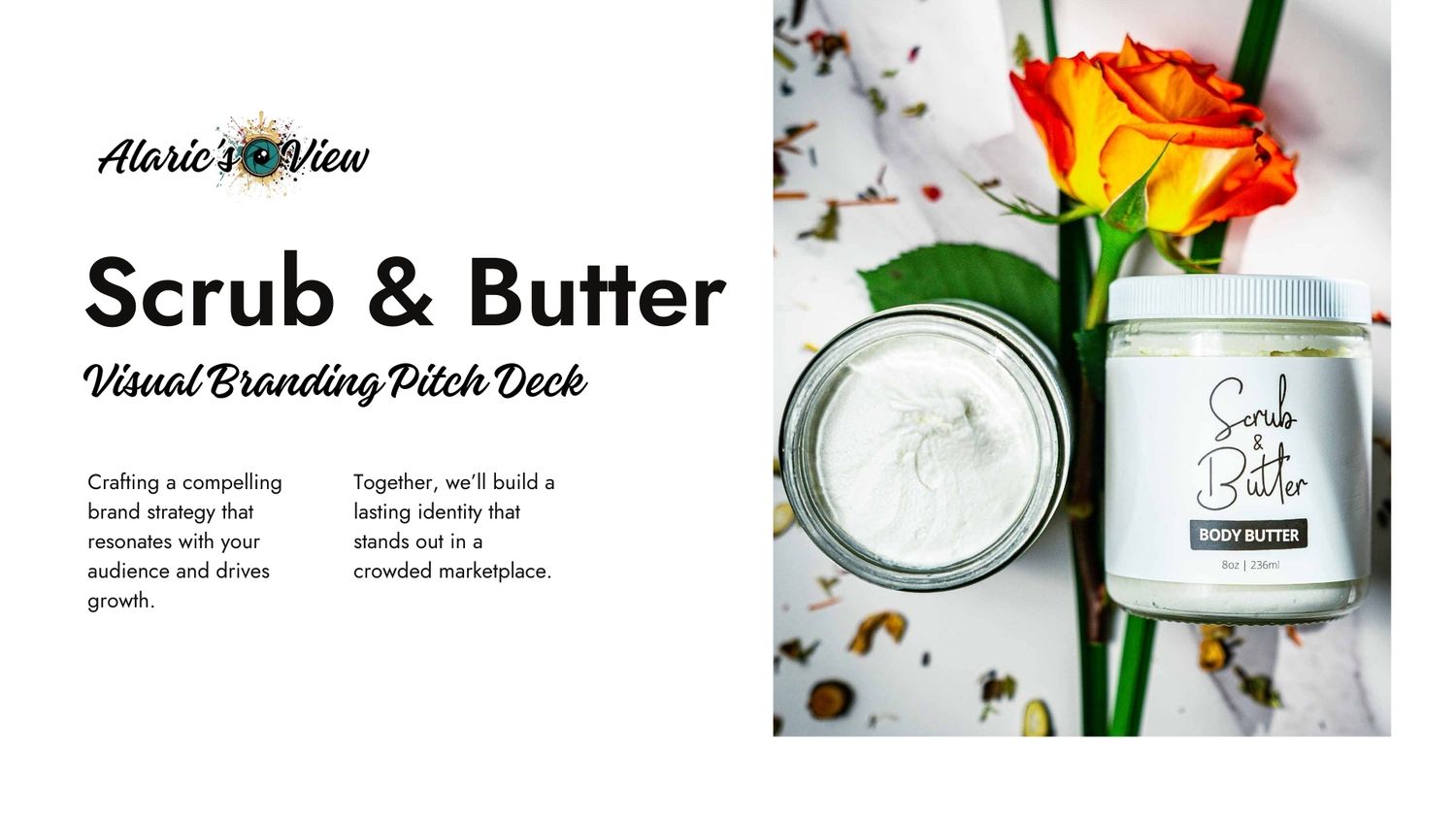
• Balanced flat lay and upright compositions for multi-platform adaptability
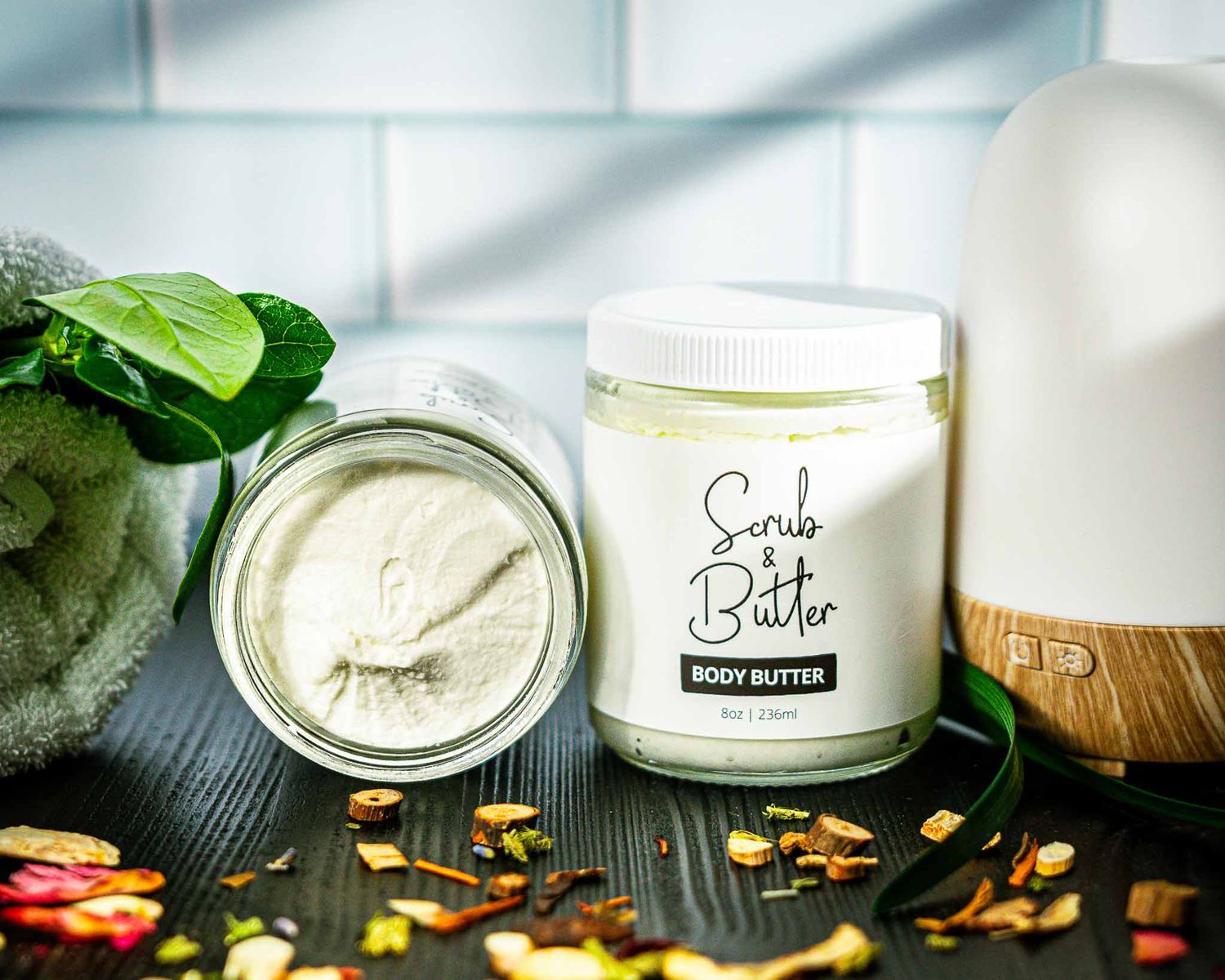
• Open-jar texture shots to provide a tactile preview for eCommerce
Each scene was intentionally constructed to create a cohesive visual ecosystem rather than isolated product images.
Execution
Deliverables included:
• Styled product photography (hero + detail shots)
• Texture-forward open jar imagery
• Stop-motion concepts for digital engagement
• Brand pitch deck outlining strategic positioning
• Visual consistency guide for future content production
The assets were designed for use across:
• Shopify product pages
• Email marketing
• Website hero imagery
Outcome
Although budget constraints prevented full implementation of the proposed campaign, the project demonstrates a scalable brand elevation framework and a disciplined visual system designed to reposition Scrub & Butter within the premium clean beauty category.
This case study reflects:
• Creative leadership under real client constraints
• Strategic brand repositioning
• Cross-platform visual planning
• Conversion-aware art direction